Collabspace Analytics Dashboard now in Private Preview for Comprehensive Content Visibility
The best data analytics features for information management use different metrics to display assets, highlighting various ways that content can be identified and analyzed. Analytics bring a graphical visualization to your reports that allow you to supervise your organizational data at a glance and provide a breakdown of information from all data within your content repositories, answering questions such as:
Where does your content come from?
What kinds of files are there?
How much volume of data am I dealing with?
... and more.
This article explains how analytics features work, and how using an intelligent solution, like Collabspace, gives administrators a visualization of their entire organization's content from a centralized dashboard (or see our article about records analytics).
We also provide a quick demo video showing how they can be used to improve your RM program:
How Do Data Analytics Features Work?
Obtaining an overview of your organizational data requires a solution with analytics features. Our cloud solution, Collabspace, streams your organizational content from all systems into one, secure data lake.
The analytics features are displayed such that metadata from all your stored documents is collected and presented graphically. The Analytics app in Collabspace gives an exact visualization of data partitioned by content source, file type, content type, and age. *
These graphs can help determine what kind of data your organization stores, accessing deeper insights and potentially finding trends in your documents. Organizations can track the progress of data uploads into their Collabspace and change the landscape of their data lake over time. Below, we’ll show examples by breaking down how each feature and dashboard can be used.
Gain Full Overview with Content Analytics Page
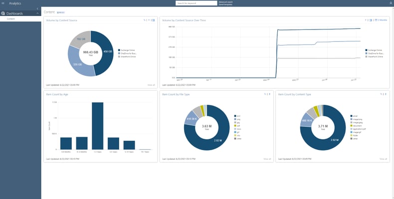
Below is a screenshot of the Collabspace Content Analytics page. Several different dashboard cards display data organized by Content Source, Content Source over Time, Age, File Type, and Content Type. Each of these cards offers a different insight into the makeup of your data lake.
Outlined in yellow are options for altering the views of individual cards between one or more of the: percentage, item count, data size, and time.
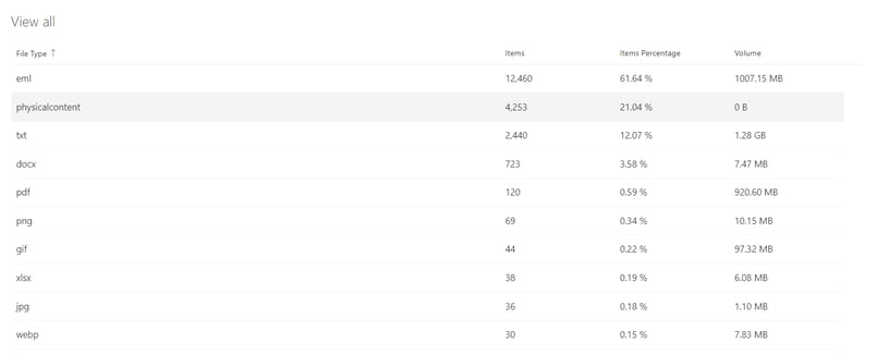
There is another feature, accessible by clicking "View All" (outlined in blue) that gives a complete list of data sorted by one of the metadata properties. For example, clicking "View All" on the Volume by File Type dashboard card will provide a table view containing all file types in the organization, including ones labelled as "Other" in the chart.
View All Content Sources
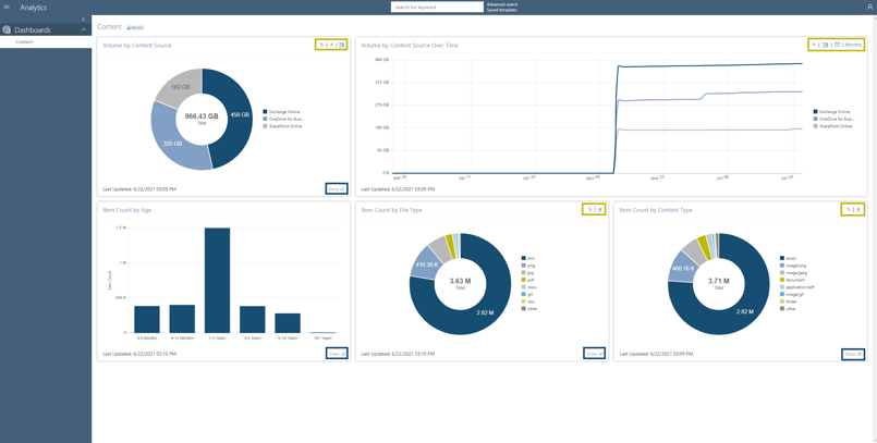
The Content Source dashboard card displays data sorted by an organization's connectors (content sources). This feature can help demonstrate the breakup of where an organization's Collabspace-stored documents originated from, whether that be SharePoint Online, Exchange Online, OneDrive for Business, File Share, or other sources.
Knowing where content is stored is valuable for both organizational and cost-savings purposes, as it allows teams to see what sources are reaching storage capacity at a glance, and plan accordingly.
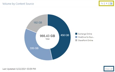
Outlined in yellow, we see the possible views: total file size (TB), item count (#), and item count percentage (%). To change this view, click on the respective symbol.
The screenshot (to the right of text) shows that the file size is selected, as it is underlined in the yellow outline, and the doughnut chart displays data size.
View Content Sources over Time
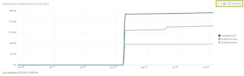
The Content Source over Time dashboard card (shown below) provides a view of all content within an organization's Collabspace, displaying it with time on the horizontal axis. This graph allows users to see their data usage in Collabspace and how it changes with time. Moreover, users can see individual trendlines for different content sources that contribute to data usage, which in the case below, are Exchange Online and SharePoint Online.
The Content Source over Time dashboard card is perfect for seeing the timeline of uploaded content to Collabspace, with the cards updating hourly to account for new imports.
Like the Volume by Content Source dashboard card, changing the view between item count and total file size is possible. This card has another option that allows users to edit the time frame shown by clicking on the calendar setting within the yellow outline below.
Determine How Old Content is with Content Age
Another beneficial feature is knowing how old the documents in your Collabspace are.
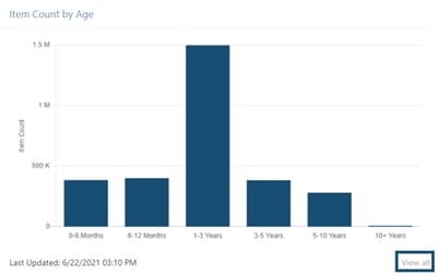
The Item Count by Age dashboard card displays the age of content by creation date, showing how old the documents stored in an organization's Collabspace are.
This card can help manage storage by identifying needlessly retained records, or simply providing a way to quickly discover the age of documents.
For example, storing documents for 10+ years is not commonly required, so an organization can use this card to locate unnecessarily stored 10+ year old data and dispose of it.
See the File Types You’re Managing
Breaking up data by File Type is an insightful tool, as it distinguishes stored documents.

Viewing which File Types are the most prominent in your Collabspace can help identify storage needs and understand business requirements.
The File Type is shown by the document's extension (png, jpg, gif). Displayed in the doughnut chart are the seven most common files, with those not a part of these seven, categorized under "other."
This card has the option of seeing the partition of data as percentages or as item count.
Identify Different Content Types
Volume by Content Type is another dashboard card that partitions data based on each document’s Content Type. A document's Content Type is metadata defined at the document's source. 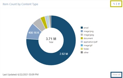
This graph allows users to see the breakup of documents in Collabspace by what format they follow. These Content Types are more user-friendly than file types, grouping data as types such as email, document, image, video, etc.
Like the File Type card, this card only displays the seven most popular Content Types, with the rest grouped under "other." If the Content Type is not available at the source, it classifies the document's mime type.
Future Advancements to Analytics App
Content analytics cards are an incredible tool for visualizing data, understanding how your documents are stored, and deriving insights to make business decisions. The Content Dashboard is just the beginning of a series of analytics features that are to come.
Collabspace also has Records Analytics features that can help records managers visualize content based on how it is categorized within file plans and record categories.
Loving what you’ve learned about how analytics can bring your organization insights with data visibility? You can read our article on how to extract insights from your organizational data with content enrichment features. We've also got a full whitepaper on how you can use artificial intelligence to transform your information management, available free below. Still have questions? Contact us to chat with our team, we’re happy to help!


* The Content Dashboard shown will be available for all Collabspace products, while the upcoming Records Dashboard will only be for Collabspace CONTINUUM users. Please contact our team if you have any questions.